BMW Introduces Its New Logo That Has Made Significant Changes
- Forum Team

- Mar 4, 2020
- 2 min read
German automotive giant BMW unveiled its new logo with the Concept i4 model it introduced yesterday. The Bavarian brand, which makes the classic black outer ring completely transparent, has a new logo with a plain and plain design approach.
BMW , one of the brands that set trends in the automobile industry , introduced the concept version of the fully electric i4, which will be released in 2021, as of yesterday . Concept i4 , which has a futuristic look, has attracted a lot of attention with its logo as well as its design and technological features .
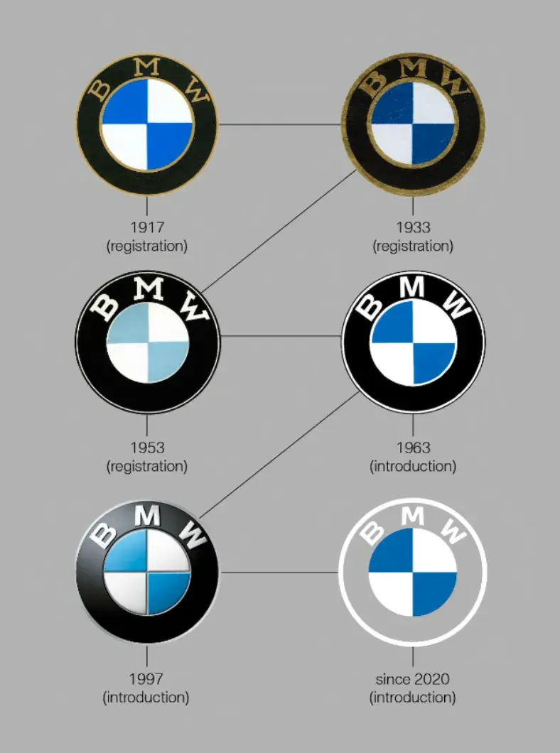
BMW, which first included its new logo in Concept i4, has made the transition to such a simple logo design for the first time in more than 100 years. Making the classic black outer ring in the logo completely transparent, the German manufacturer has created a very minimal design.

The apartment design continues to use the white and blue colors of the state of Bavaria , the company's headquarters . The logo, in which both classic and modern elements are blended wonderfully, follows the 103-year heritage of the iconic brand.
BMW logos from past to present

Jens Thiemer, Head of BMW Marketing Communication, said the logo they designed by centering digitalization offers drivers more transparency and clarity . The removal of the black ring in the logo seems to be the biggest change in the logo since its introduction in 1917.
The electrification process in the automobile industry has transformed vehicles into a much more minimal and stylish form. Taking into account the changing design trends while designing the new logo, BMW signals the world of electric cars as fully integrated. The Bavarian manufacturer, who wants to own at least one million electric vehicles by 2021, aims to be an ambitious competitor to industry leader Tesla .


Comments